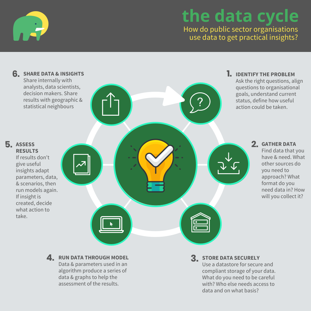
We know that making smarter use of data in the public sector is important to transformation and effectiveness - we’ve seen data put to work, by us and others, for purposes from detecting fraud to modelling the impact of new policies. But how does this process happen in practice? We’ve put together an infographic that illustrates a six-stage process that is common to data projects that have impact.
With support from Innovate UK, Mastodon C has been working with local authorities and cities across the UK, developing Witan, a platform designed to apply modern data science techniques to the challenges of local government. An important part of our work, and an awful lot of the time spent, has been on getting a better understanding of the ways that data can be used to generate useful answers and develop better services in the unique circumstances of local government.
We found that public sector data projects have six common features that together create a virtuous cycle of impact and improvement, as shown in the infographic below. We find this cycle an incredibly helpful memory aid and shared map, to keep track of where we are, review progress with heads of service, and to always remind us that the process is cyclical: the first go around is almost never the end of the story, no matter how clever or speedy your team (if only life were that simple!). I hope you find it useful as well.
The data cycle - how to get the answers you need from data

Want a more detailed explanation of each step and a handy checklist to help you do practical work with data?
Share this article
